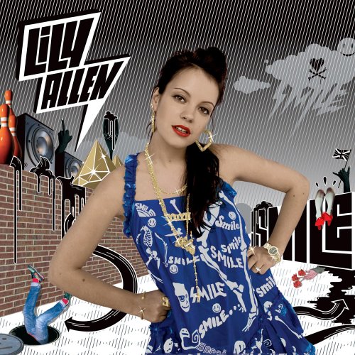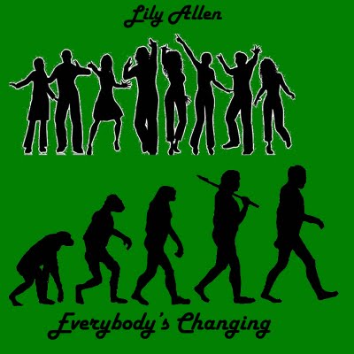
To make the album cover we decided not to use anything from the music video for album cover because we noticed that even though many of Lily Allen's album covers do this, we wanted to be like the majority of other professional artists and to have something colour and aesthetically pleasing. Therefore, we decided to make them both, completely from scratch. We acquired the image of the evolution chain and the image of the different people in different stances and position from Google Images. Nikil and I then used Adobe Photoshop to crop and colour the upper image of the people as its original form was different. We also had to do the same with the evolution chain image as its background colour was also different. After editing both images we placed them in Adobe Fireworks and put them together with the font, after colouring the rest of the background green, the cover was done.

Parts of this design was related to the song itself, it has an image of the evolution of man - from the ape to human, this related to the song name - Everybody's changing as there was a clear image of the ape changing into the form of a man. Also the upper image of the different people standing in different stances and positions related to the song name, it relates to the song name as all of them are different and changing stances as the image goes along.
This album cover had almost no similarities to the original albums, as we made two album covers, the second design was related to the existing albums as it had a comical and humourous aspect to it, this is similar to the existing covers as most of them have a comical style and occasionally an image or two made for humour.
In my opinion the final cover did not have many eye catching features and it did not have any special colours or patterns on it, the only colours used on it was black, white and green, although there was only these three colours, a certain part of it made it very bold and attractive.
To get more feedback on our covers we asked fellow students what they thought on our covers, most of them voted the first design to be the better one, and that it suited the song name and theme more than the other design did.
A logo is recognisable picture, usually backed up by a slogan, which is the reason companies logo all of their products in some way or another. Most of the worlds most recognisable logos have little or no words in them, they just contain one or two items or words. This has also been replicated by artists who are or want to be recognised by just a small logo.

No comments:
Post a Comment